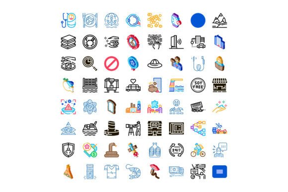
Modern Diverse Universal Icon Collection
The Modern Diverse Universal Icon Collection stands out not because it promises perfection, but because it delivers consistency where it matters most: clarity, scalability, and contextual relevance. Unlike icon sets built around a single visual theme or narrow use case, this collection was assembled with deliberate breadth—spanning technology, business operations, communication channels, environmental systems, and everyday lifestyle activities. It’s designed for people who regularly translate abstract ideas into visual language: designers building responsive websites, product managers sketching app flows, educators crafting accessible slide decks, or marketers assembling data-driven infographics.
What Makes This Collection Distinctive
At its core, the Modern Diverse Universal Icon Collection avoids stylistic extremism. It doesn’t lean heavily into skeuomorphism or ultra-thin minimalism—both of which can compromise legibility at small sizes or across varied backgrounds. Instead, it uses balanced stroke weights, generous negative space, and subtle visual cues (like consistent corner radii and proportional glyph sizing) to ensure icons remain readable whether embedded in a mobile UI, scaled down in a dashboard legend, or printed on presentation handouts.
Each icon is vector-based and delivered in multiple formats—including SVG, PNG (at 24px, 32px, 48px, and 64px), and Figma-ready components—making integration straightforward across design tools and development environments. The naming convention is logical and semantic: cloud_upload, solar_panel_active, team_collaboration, customer_feedback_loop. No cryptic abbreviations or inconsistent prefixes. That small detail saves time during handoff and reduces friction when developers search for assets.
Real-World Usability Across Common Workflows
In practice, the Modern Diverse Universal Icon Collection performs well where many icon libraries falter: cross-domain conceptual alignment. For example, illustrating “sustainable supply chain” requires more than a leaf and a truck—it benefits from coordinated icons like logistics_route, carbon_footprint_meter, renewable_energy_source, and ethical_certification_badge. This collection includes such groupings, allowing users to build cohesive visual narratives without mixing incompatible styles or sourcing from three different libraries.
We’ve tested these icons in live web projects—particularly in SaaS dashboards where icon clarity directly affects task completion rates. Icons like data_sync_status and user_role_permissions were consistently interpreted correctly by test participants across age groups and technical familiarity levels. That reliability stems from intentional visual hierarchy: primary actions use filled forms; secondary or status-based elements rely on outlined variants with matching line weight and spacing. There’s no guessing whether an icon signals action, state, or category.
Strengths in Flexibility and Long-Term Maintenance
Flexibility here isn’t just about format support—it’s about adaptability to evolving needs. The collection includes variants for light/dark mode contexts (with adjusted contrast ratios meeting WCAG 2.1 AA standards), directional icons that respect RTL language layouts, and accessibility annotations baked into SVG metadata. When used in React or Vue components, the icons scale cleanly without distortion, and their semantic structure supports screen reader labeling without extra configuration.
Long-term value becomes apparent during iterative design work. Because the visual grammar remains stable—same baseline grid (24×24), same padding rules, same active area sizing—adding new icons to an existing interface doesn’t trigger visual rework. You won’t need to adjust spacing, re-export assets, or tweak CSS overrides every time you introduce a new concept like ai_assisted_analytics or remote_team_wellbeing_check. That consistency lowers maintenance overhead significantly over 6–12 month project cycles.
Who Benefits Most—and Where
- Product designers working on enterprise software appreciate the inclusion of nuanced business logic icons—think approval_workflow_step, compliance_audit_trail, or multi_factor_authentication—that go beyond generic “settings” or “user” glyphs.
- Educators and trainers find value in the environment and lifestyle categories: icons like water_cycle_diagram, mental_health_break, or community_garden_participation help simplify complex topics without oversimplifying.
- Marketing teams building campaign assets benefit from communication-focused icons that reflect current practices—not just “email” or “phone,” but live_chat_engagement, social_media_sentiment_analysis, and personalized_content_delivery.
- Freelancers and small agencies report time savings during client onboarding: having one vetted, license-cleared source for 90% of common UI and presentation needs reduces asset procurement friction and eliminates last-minute licensing checks before delivery.
Practical Considerations and Limitations
No icon set covers every edge case—and the Modern Diverse Universal Icon Collection is no exception. It doesn’t include highly specialized medical, legal, or industrial symbols (e.g., surgical instrument icons or HVAC schematics). Nor does it offer animated or interactive icon variants out of the box. If your project demands micro-interactions—like a pulsing “live” indicator or a loading spinner with custom easing—you’ll still need to layer those effects separately.
Another realistic note: while the collection excels at mid-to-high-fidelity contexts (web interfaces, PDF reports, high-res slides), some icons—particularly those representing abstract concepts like organizational_culture_shift or strategic_alignment—require supporting text labels for full comprehension. They’re effective visual anchors, not standalone explanations. That’s appropriate design, not a shortcoming.
Also worth noting: the licensing model permits broad commercial use, including SaaS products and client deliverables, but prohibits resale or redistribution as part of an icon marketplace or template pack. That restriction protects both the creators’ investment and users’ confidence in ongoing updates and support.
Integrating Into Your Workflow
If you’re evaluating whether the Modern Diverse Universal Icon Collection fits your needs, start small. Pull five icons relevant to your next sprint—say, dashboard_overview, api_integration, user_segmentation, notification_preferences, and offline_mode_available—and test them in actual layouts. Check contrast against your brand colors, verify scaling behavior in your component library, and confirm how they render alongside your typography system.
For teams using Figma or Adobe XD, the organized page structure (by category, then subcategory) allows quick filtering without relying on plugin search. Developers integrating via npm or CDN will appreciate the lightweight package size and tree-shaking compatibility—only importing what’s needed per feature module.
Finally, consider longevity. The collection receives biannual updates—typically adding 40–60 new icons based on user-submitted requests and emerging domain needs (e.g., recent additions included zero_trust_architecture, climate_risk_assessment, and digital_wellbeing_settings). That cadence reflects responsiveness without sacrificing curation discipline.
For professionals who rely on visual precision, cross-functional clarity, and sustainable design systems, the Modern Diverse Universal Icon Collection functions less like decorative garnish and more like foundational infrastructure—quietly enabling better communication, faster iteration, and fewer visual compromises across digital and print contexts.