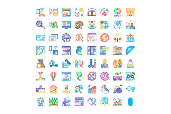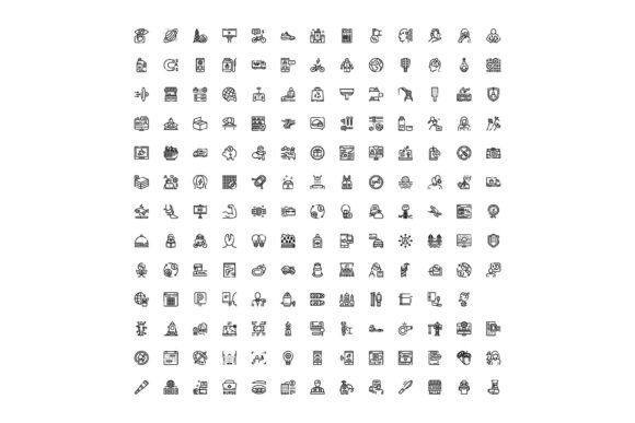
Universal Line Icons Collection for Web
Icons are more than decorative elements—they’re functional signposts. In web interfaces, mobile apps, and infographics, a well-chosen icon communicates faster than text, reduces cognitive load, and strengthens visual hierarchy. The Universal Line Icons Collection for Web stands out not because it’s the largest or flashiest, but because it addresses a consistent, everyday need: clarity without compromise. It’s a curated set of outline-style icons designed specifically for digital contexts where scalability, consistency, and semantic accuracy matter.
What Sets This Collection Apart
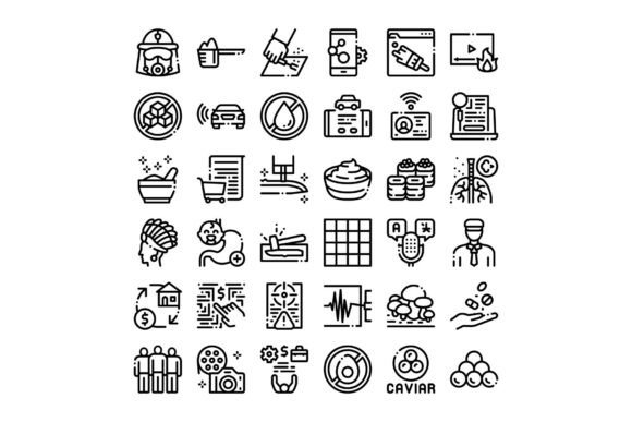
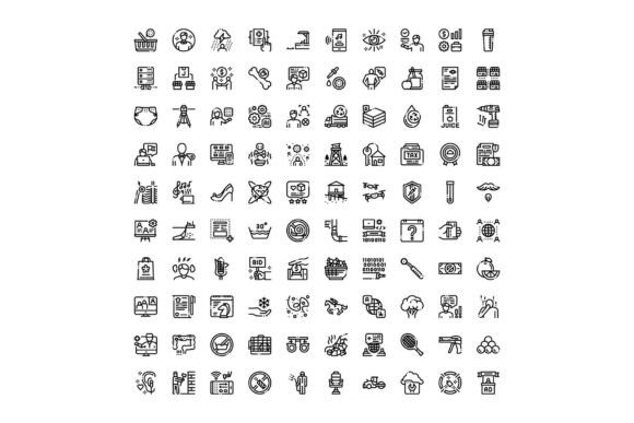
Unlike sprawling icon libraries that mix styles, weights, and proportions, the Universal Line Icons Collection for Web follows a strict design language: clean, single-stroke outlines with uniform stroke width (typically 2px), consistent corner radii, and balanced negative space. Each icon is built on a 24×24 grid, exported in SVG with minimal path data—no embedded metadata, no redundant groups. That means smaller file sizes, predictable rendering across browsers, and straightforward customization via CSS or inline attributes.
The collection covers four core domains: business (e.g., analytics dashboards, pricing tables, team roles), technology (cloud, API, encryption, server, code), communication (chat, email, call, notification, feedback), and daily essentials (calendar, location, settings, search, download). There are no novelty icons—no “rocket launch” for “submit” or “lightbulb” for “idea.” Instead, you’ll find a calendar icon that clearly signals date selection, a lock icon that reads unambiguously as security, and a speech bubble that works equally well for live chat or comment threads.
Real-World Usability in Practice
In actual development workflows, icon consistency directly impacts maintainability. A designer handing off to a developer benefits from icons that don’t require manual alignment tweaks or stroke normalization. Developers appreciate that every SVG in the Universal Line Icons Collection for Web uses the same viewbox, same coordinate origin, and identical naming conventions—no surprises when importing into React components or CSS background-image stacks.
One practical example: a SaaS dashboard using tabs for “Billing,” “Usage,” and “Support.” With this collection, the billing icon (a simple wallet outline), usage graph (bar chart with clean axis lines), and support (a headset with minimal detail) share the same visual weight and spatial footprint. Users scan them quickly—not because they’re flashy, but because their structure supports rapid recognition. That predictability scales: whether rendered at 16px in a table row or 48px in a marketing landing page hero section, the icons retain legibility and proportion.
Flexibility Without Fragmentation
Flexibility here doesn’t mean endless variations—it means thoughtful adaptability. All icons are provided in SVG format, with optional Figma and Sketch source files. You can recolor them with CSS fill, adjust stroke width with stroke-width, or apply subtle transitions on hover—all without breaking alignment or introducing rendering inconsistencies.
There’s no “bold” or “filled” variant included by default, and that’s intentional. The collection assumes you’ll layer meaning through context—not weight shifts. If your interface needs emphasis, use spacing, typography, or background contrast instead of switching to a heavier icon style mid-flow. This restraint avoids visual fragmentation, especially in responsive layouts where icon density changes across breakpoints.
Who Benefits—and When It Fits Best
The Universal Line Icons Collection for Web serves professionals who prioritize execution over ornamentation: frontend developers building accessible form controls; product designers crafting onboarding flows for B2B tools; educators designing interactive course modules; small business owners updating their WordPress site with clear service indicators; or content creators assembling data-driven infographics for newsletters.
It’s especially effective when:
- You’re maintaining a long-lived product and need icons that won’t date quickly;
- Your audience includes users relying on screen readers or low-bandwidth connections (SVGs load fast and scale cleanly);
- You’re integrating icons into systems with strict design tokens (e.g., defined color palettes, spacing scales, or typography rules);
- You’re documenting processes or building internal tools where clarity trumps brand personality.
Freelancers and agencies also find value here—not as a one-size-fits-all solution, but as a reliable baseline. You can extend it selectively (e.g., adding two custom icons for niche features) without destabilizing the overall system. That modularity reduces decision fatigue during sprint planning or client revisions.
Limitations Worth Noting
No icon set solves every problem. The Universal Line Icons Collection for Web doesn’t include animated variants, icon fonts (WOFF/SVG fonts), or raster formats like PNG—by design. If your project requires icon fonts for legacy IE support or needs animated loading states, you’ll need supplemental assets.
It also avoids metaphorical or abstract representations. There’s no “synergy” icon or “disruption” glyph—because those rarely translate reliably across cultures or experience levels. That’s a strength for global or inclusive applications, but may feel limiting if your brand voice leans heavily into conceptual illustration.
Additionally, while the collection covers common concepts thoroughly, highly specialized domains—like medical diagnostics, industrial IoT, or legal compliance—aren’t its focus. You’ll find a generic “document” icon, but not distinct variants for “HIPAA consent form” vs. “GDPR data processing agreement.” In those cases, supplementing with purpose-built assets remains necessary.
Integration and Long-Term Value
Adopting the Universal Line Icons Collection for Web isn’t about installing a plugin—it’s about aligning with a design philosophy: reduce ambiguity, respect constraints, and serve function first. Teams that document icon usage in a shared style guide (e.g., “Use user-circle for authenticated profiles, user-plus only for invite flows”) get the most long-term value. That discipline pays off during audits, accessibility reviews, or redesign sprints.
From a technical standpoint, SVG integration is straightforward: import individual files, use for sprite-based reuse, or bundle via build tools like Webpack or Vite. No external CDNs or JavaScript dependencies are required—meaning fewer points of failure and better control over performance budgets.
A Final Observation
Good iconography doesn’t draw attention to itself. It disappears into the experience—until it’s missing. The Universal Line Icons Collection for Web succeeds by refusing to overpromise. It doesn’t claim to replace illustration, nor does it try to be everything to everyone. What it delivers is reliability: a set of tools that behave as expected, render consistently, and support real tasks—whether you’re labeling a filter menu in a fintech app, annotating a supply chain diagram, or clarifying a privacy policy section for non-technical users. For professionals who measure quality in shipped features, maintained codebases, and understood interfaces—not just pixel-perfect mockups—that’s where its utility becomes unmistakable.